
Madison Gas & Electric
Goal:
To redesign the website, enhancing the user experience, all in a short timeframe
My Role:
UX Designer, Front-End Designer & Developer, Visual Designer
Team:
Myself, UX/CX Designer, CX Manager, Product Managers/Business Owners, Content Manager, Developers

Timeline:
14 Months
Areas of Focus:
UX & Visual Design — modernize brand presentation, streamline IA, enhance editable
components for content editors, and improve underlying UX for customers.

Overview
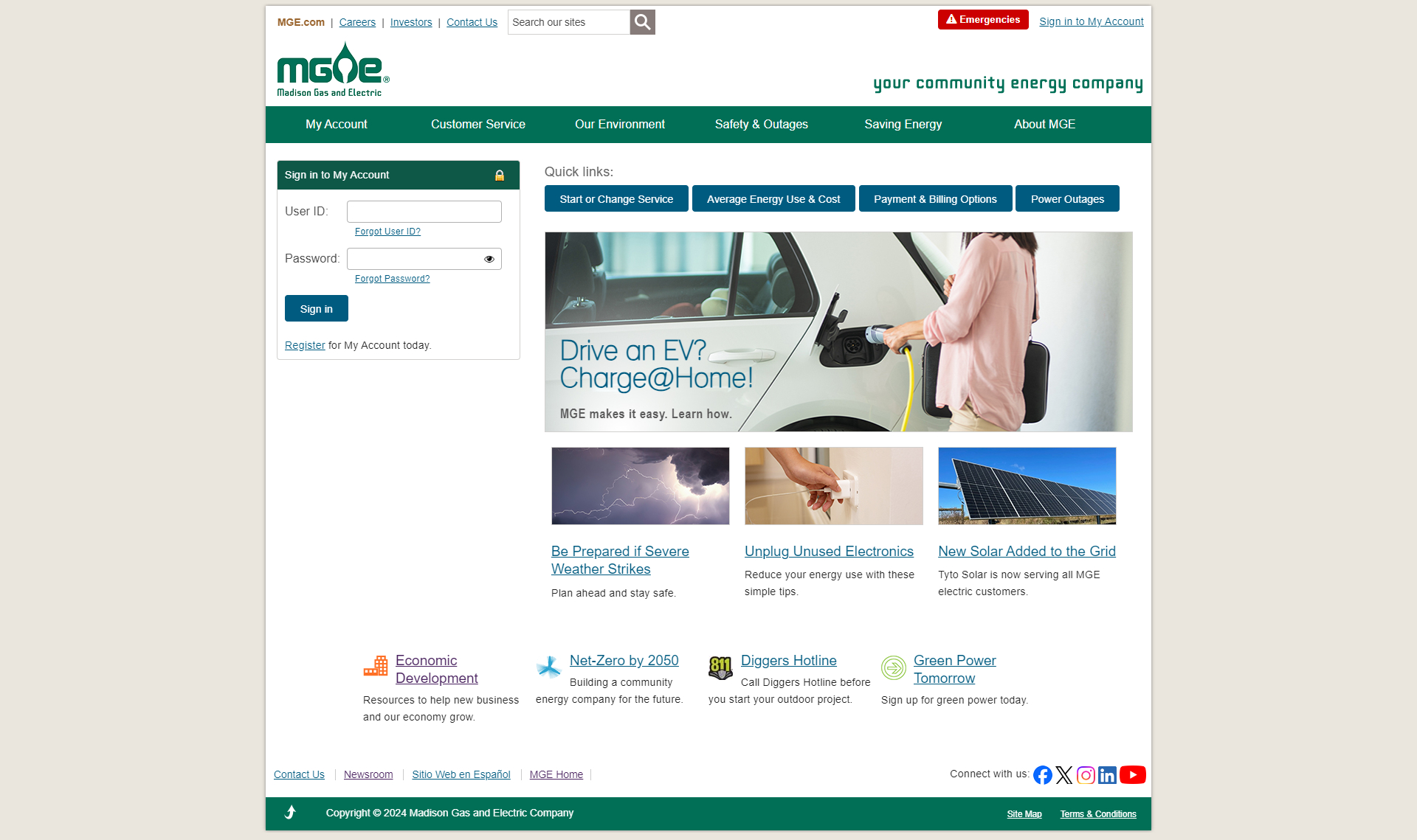
MGE needed to revamp an outdated site (which felt "1990s") into a visually appealing, intuitive site with improved content editing experience and a user-centric UX for customers. This update not only focused on improving the visuals and some UX, but we also wrote a cleaner code base that was both scalable and accessibile.
MGE Before Redesign
Approach
- Conducted focus groups and stakeholder workshops to surface user pain points (both customers and internal editors).
- Created four stylescape visual directions to align visual design language with brand heritage + modern expectations.
- Ran card-sorting for IA refinement, preference tests for component/layout decisions, 5-second tests for messaging impact, and System Usability Scale (SUS) surveys for baseline and iterations.
- Implemented responsive front-end build, component library, editor-friendly templates, and QA across devices.
- Post-launch agile iterations and analytics monitoring of engagement, conversion, bounce rates, and user feedback.
Findings
- Focus groups revealed customers felt the brand was “stiff” and site “old-school”; they wanted simpler language, clearer tasks, and more relatable visuals.
- Card sorting simplified IA: reduced number of top-level navigation items, decreasing clicks to key tasks.
- Editors reported improved efficiency: fewer templates to manage, better reuse of components, and faster created pages.
- Post-launch user feedback has been very positive with users saying "I love the new My Account. It is so much easier to use with the larger text and boxes".
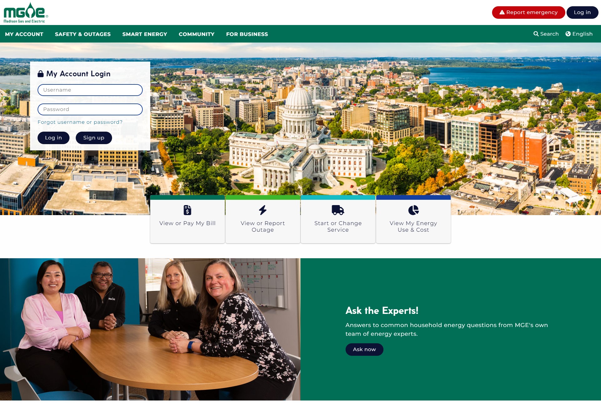
MGE After Redesign
Outcome & Impact
- Delivered a modernized MGE customer website with fresh visuals, updated brand tone, streamlined navigation, and scalable editor components.s
- Improved content editor experience: new component library enabled faster page creation and reduced design-to-publish time.
- Accessibility score on SiteImprove went up from 67% to 96%, an increase of ~28%.
- Easier access to key tasks (Log In, Pay Bill, Outage Map, Start/Stop Service) and clearer visual cues.
- Gained deeper collaboration across internal teams and set groundwork for future UX/design improvements.
- Incorporated analytics and dashboards into all content to understand how our content is performing.
Reflection
Handling multiple stakeholders required clear design governance, even more so when pressured with a short timeline to accomplish so much. This project was a great value in learning so many things at once, but the biggest for me was embedding analytics and feedback loops early so post-launch improvements are guided by real-user data, not just internal reviews.
If I had the opportunity to do this again, I would push for more quantitative baseline metrics pre-launch (task completion rates, bounce rates by device) and deeper accessibility testing.