GENRE 2030
Goal:
Design a clean, intuitive, visually engaging brand & website that connects with 20-30-year-olds (millennials),
promotes MGE’s products/programs in a way that feels meaningful and subtle, while surpassing business needs and user expectations.
My Role:
Brand Designer, UX Researcher, Information Architect, Visual Designer, Front-end Developer,
UX Tester; also acted as PM & Business Analyst (given small team)

Team:
Myself, Program Owner, UX Designer, Content Manager
Timeline:
12 Months
Areas of Focus:
Branding, Visual Design, UX Research, UX Testing, Persona Development

Summary
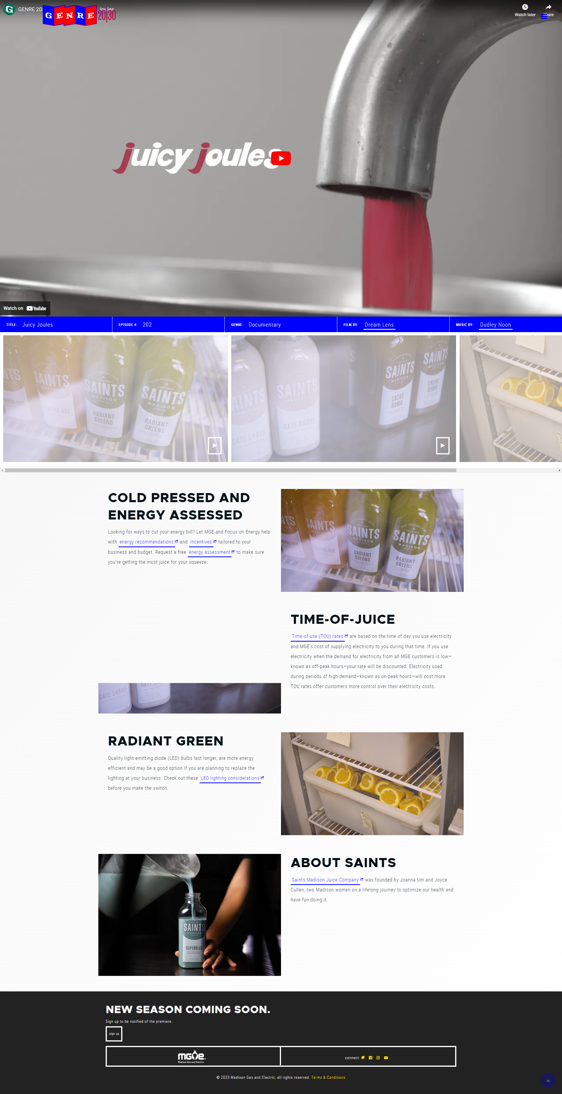
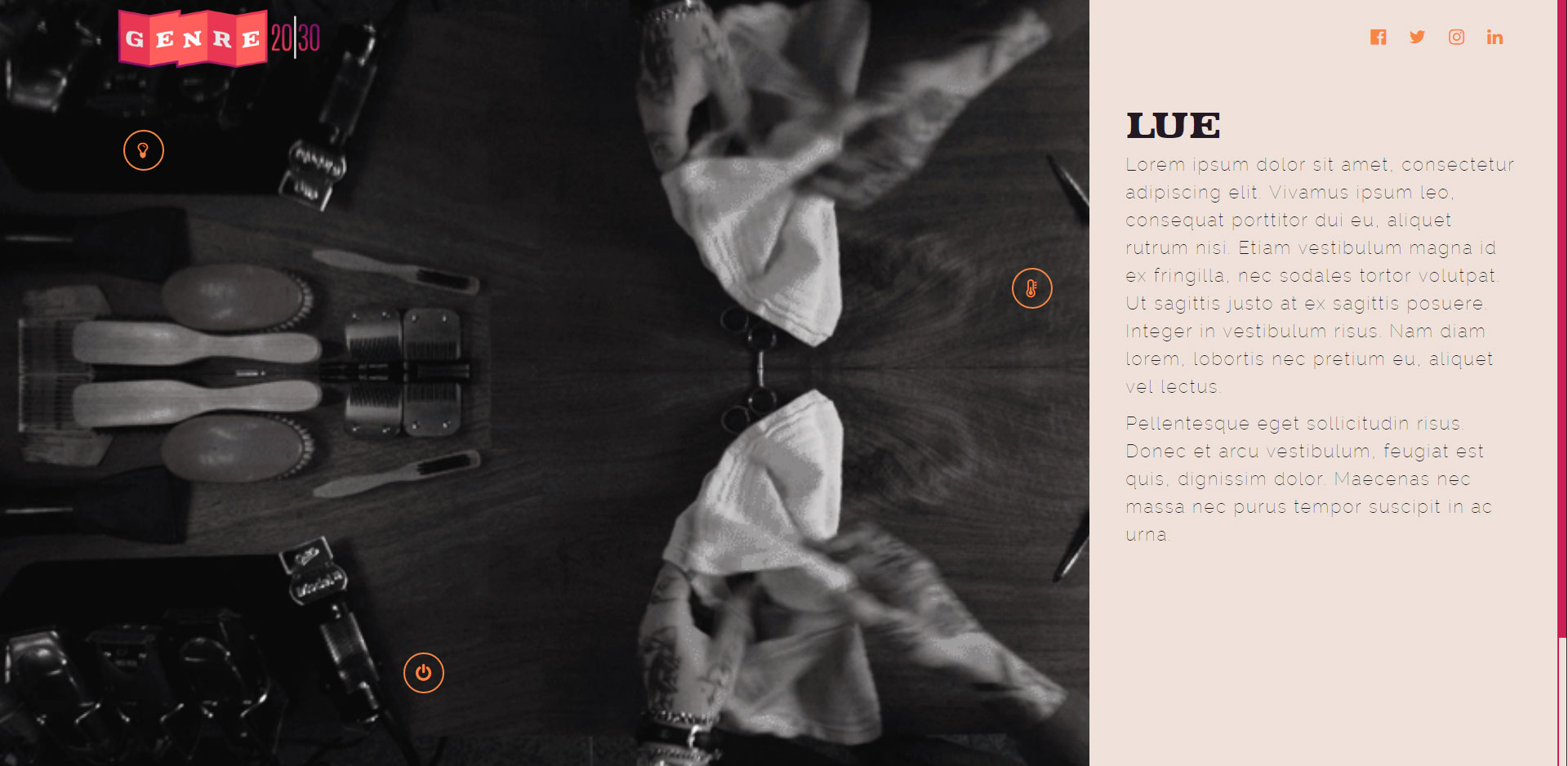
MGE's messaging & brand had not strongly resonated with younger audiences (20-30 year olds). The existing marketing or digital presence didn’t feel relevant or “fresh” to that group. Marketing wanted a brand/website that balanced creativity and professionalism: must generate interest, but still align with MGE’s values and reputation. Users may feel utility companies are stiff/boring; challenge was to infuse more personality without sacrificing clarity or usability.
Approach
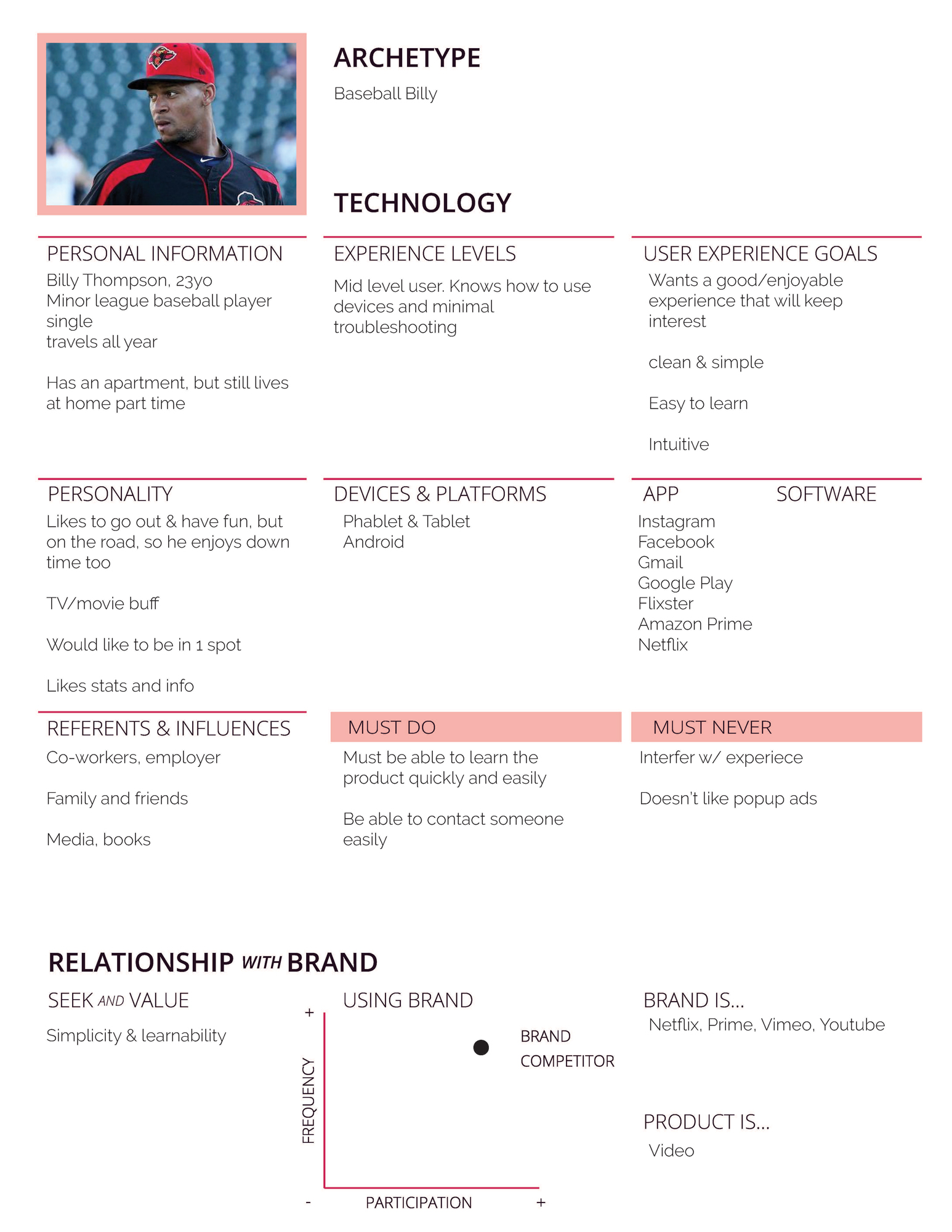
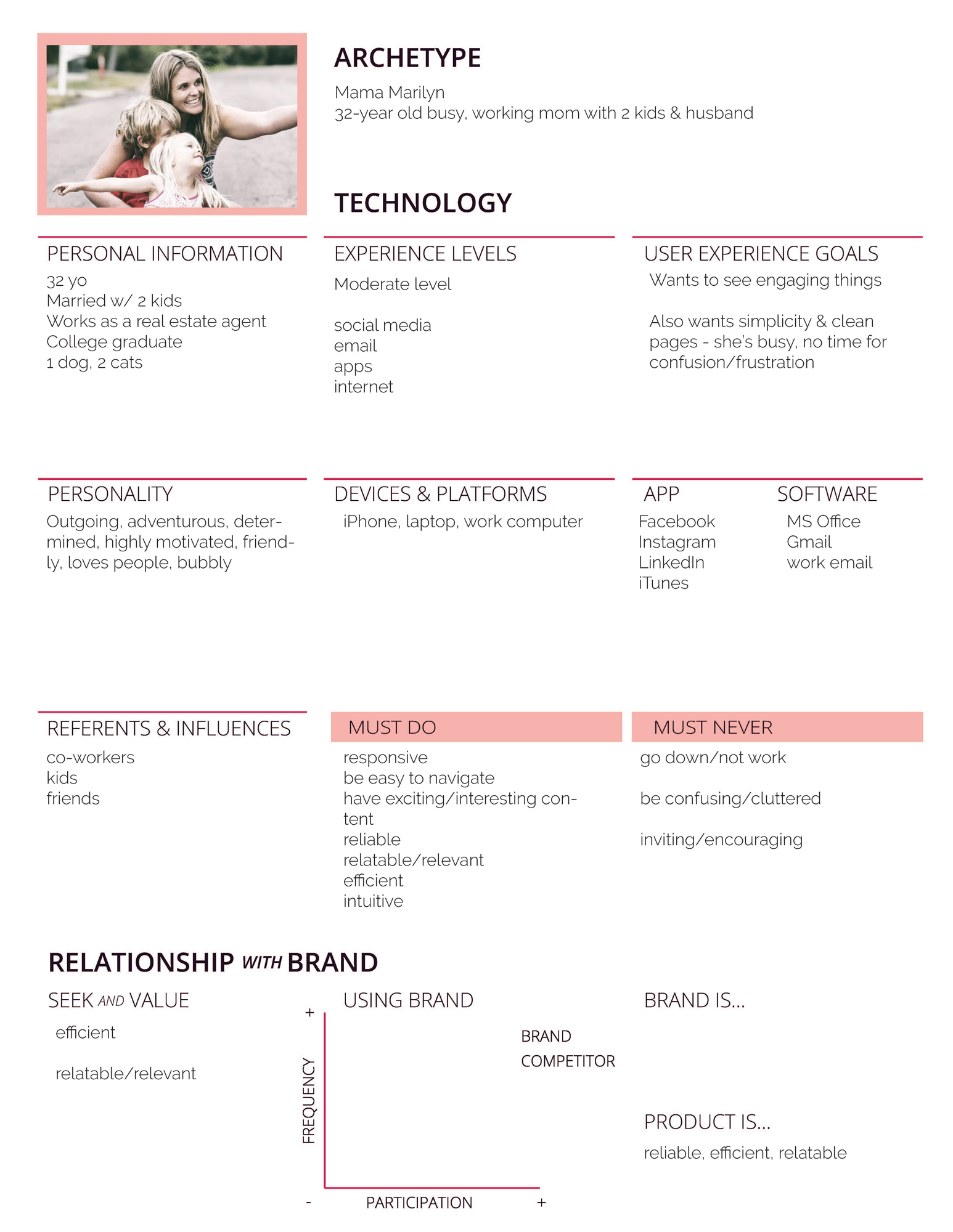
- Conducted persona development workshop with marketing team to define archetypes (e.g. “Baseball Billy”, “Mama Marilyn”, etc.) to capture needs, motivations, challenges.
- Researched design inspiration from streaming platforms etc., to see what visual styles appeal to younger audiences.
- Built early mockups, tested with users & stakeholders; collected feedback about visual style, complexity, readability.
- Iterated quickly: simplified designs when users found them “too busy” or “overly complex.”
- Did usability testing both pre-launch and post-launch to verify uptake, comprehension, and sentiment of visual/brand presentation.
Findings
- Early designs were perceived as too visually cluttered; users prefer cleaner layouts with more whitespace and simpler navigation.
- Personas helped focus design decisions: visual tone, content hierarchy, imagery that aligned with user archetypes.
- Iteration based on usability feedback led to significantly improved user sentiment: users felt the final design was “clean,” “modern,” “welcoming” (vs early designs described as “busy” or “confusing”).
- Stakeholders appreciated seeing actual feedback from users, which helped align expectations.
Outcome & Impact
- Delivered a final website & branding identity that met and in some cases exceeded expectations: users responded positively; one user said they didn’t know “MGE was a patron of the arts,” which reinforced strong branding impact.
- The site is more approachable/engaging to younger audiences, helping MGE expand its perceived relevance beyond traditional utility branding.
- Internally grew trust among teams unfamiliar with creative branding and showed possibility for pushing creative horizons in the utility space.