Wisconsin Department of Justice
Goal:
Redesign the DOJ site to modernize the look, simplify navigation, make it responsive and accessible,
and remove outdated content to improve usability and information findability.

My Role:
UX & Visual Designer (transitioned from webmaster to UX role)
Team:
Myself, Content Manager, Senior Leadership
Timeline:
6 - 9 Months

The Problem
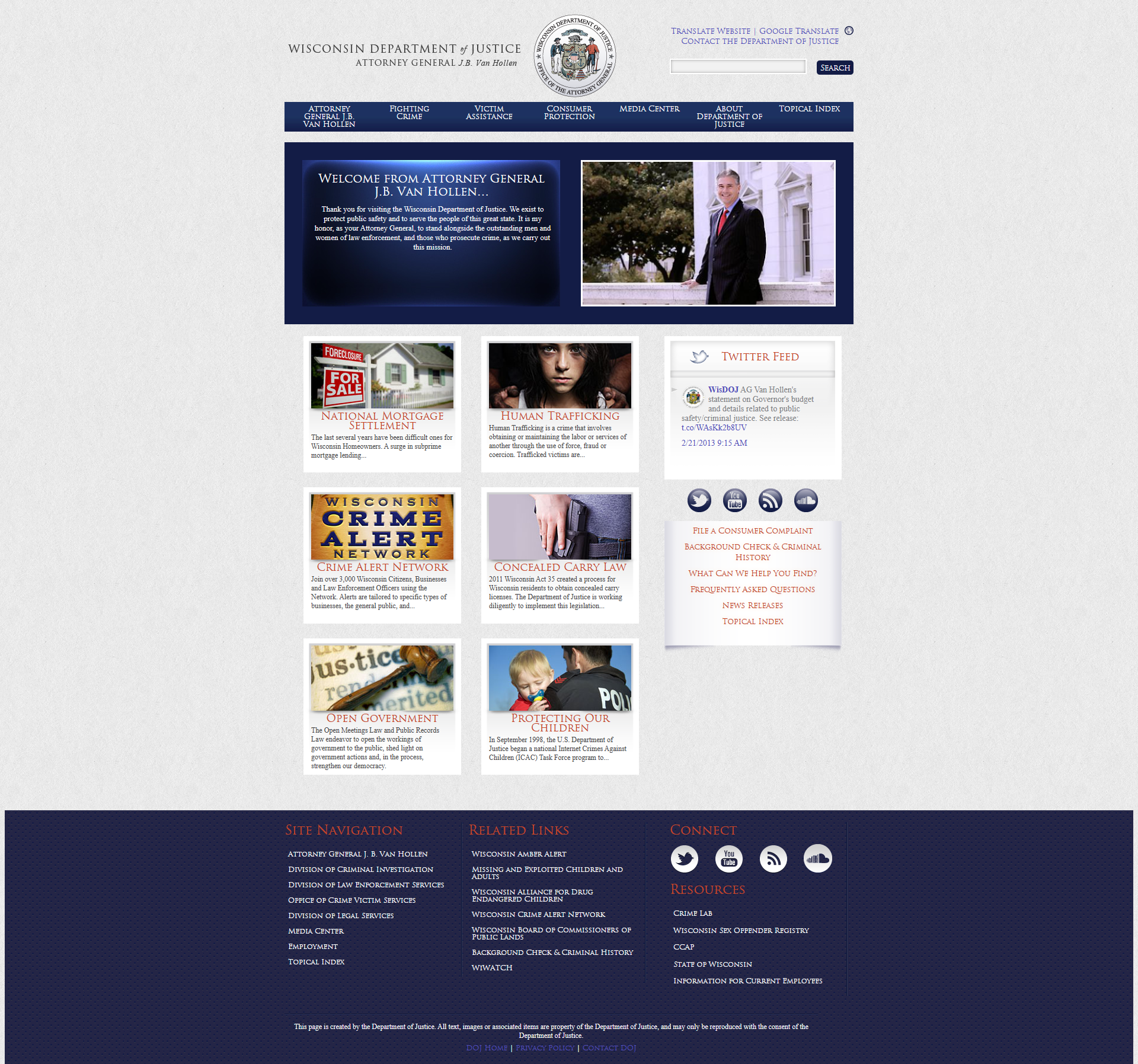
- The existing site was dated, not responsive, with confusing navigation and too much content.
- Users struggled to find important content in a bloated information architecture.
- The new Attorney General wanted a cleaner, modern design that aligned with state branding, improved user experience, and reduced maintenance burden.
- Success would be measured in improved usability, reduced bounce/dropoff, more efficient site upkeep, and stakeholder satisfaction.
DOJ Before Redesign

Approach
- Performed stakeholder interviews to align on priorities and vision.
- Conducted content audit/inventory of existing site to identify pages to remove or consolidate.
- Developed low-fiwireframes and UI mockups reflecting new IA.
- Incorporated stakeholder feedback loops and iterative design reviews.
- Ensured responsive design and accessibility considerations (e.g. contrast, mobile nav).
Findings
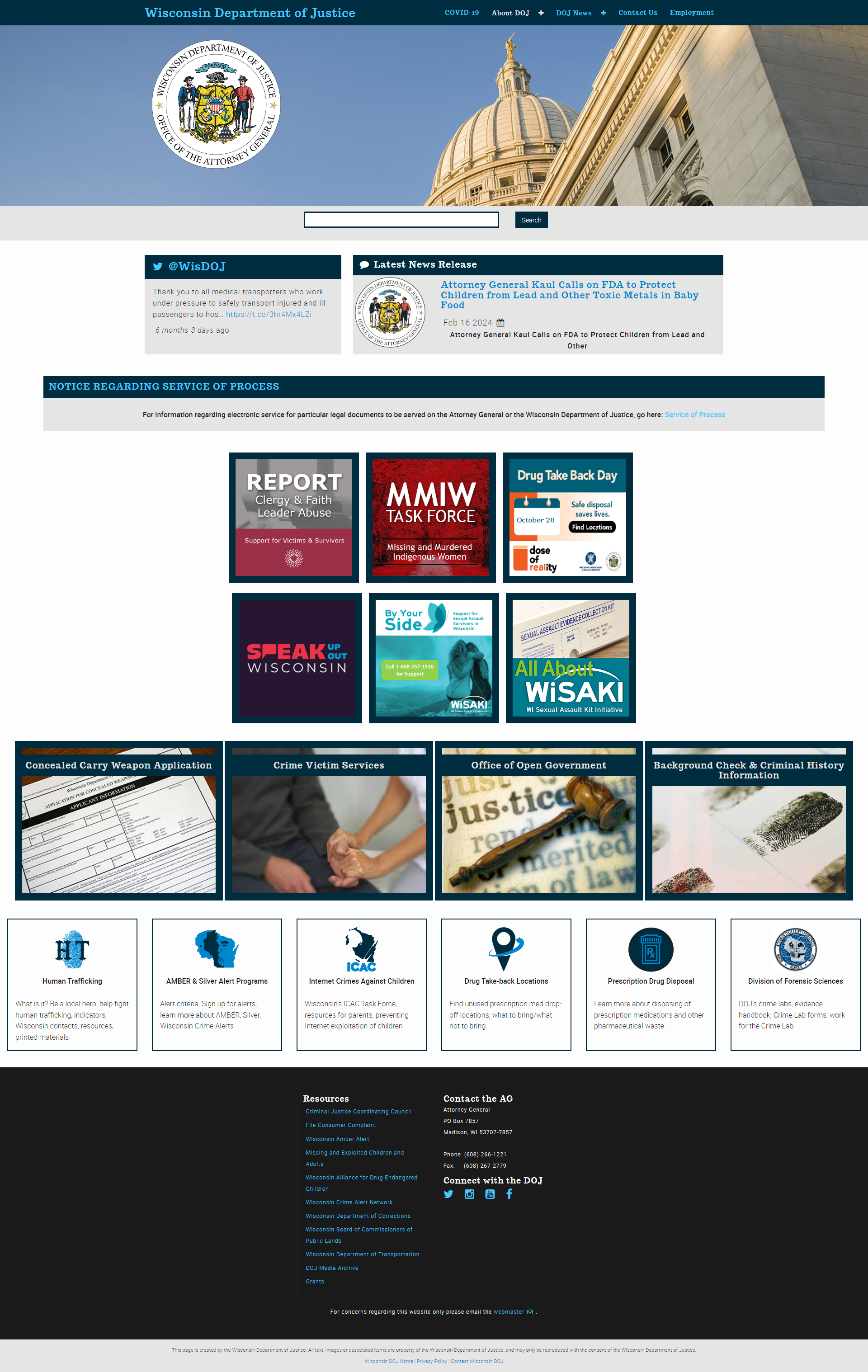
- Users and stakeholders agreed that many pages were redundant or outdated; trimming 20% of pages improved clarity.
- Simplified navigation transitions led to fewer clicks to reach key sections.
- Visual design refresh increased user perception of trust and legitimacy (stakeholder feedback).
- Winning “Redesign of the Year for AG websites” validated external recognition of the redesign.
DOJ After Redesign

Outcome & Impact
- Performed stakeholder interviews to align on priorities and vision.
- Conducted content audit/inventory of existing site to identify pages to remove or consolidate.
- Developed low-fiwireframes and UI mockups reflecting new IA.
- Incorporated stakeholder feedback loops and iterative design reviews.
- Ensured responsive design and accessibility considerations (e.g. contrast, mobile nav).
Reflection
This project was instrumental in defining and expanding my UX role within a government context. I gained experience working with multiple stakeholders, balancing political or institutional constraints with usability goals. If redoing it, I’d push for more user testing (before and after), deeper metrics tracking, and stronger accessibility audits (WCAG) upfront.

