Madison Gas & Electric
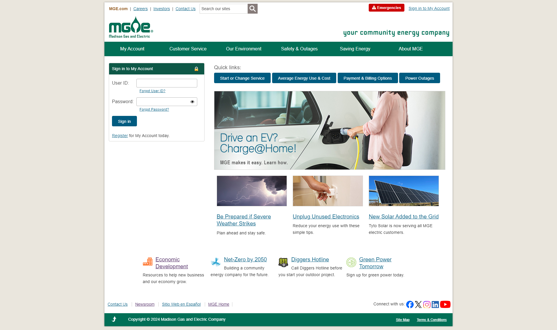
Old Design
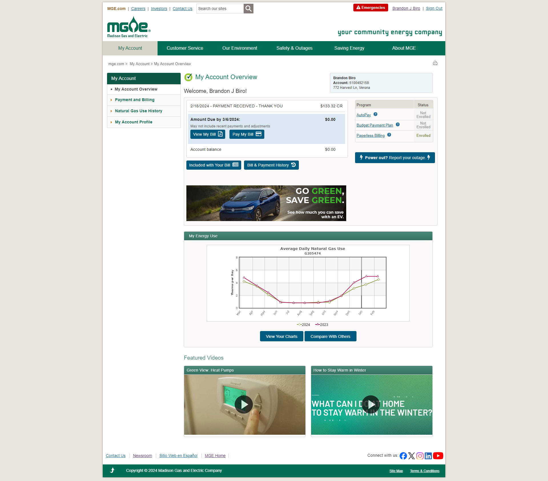
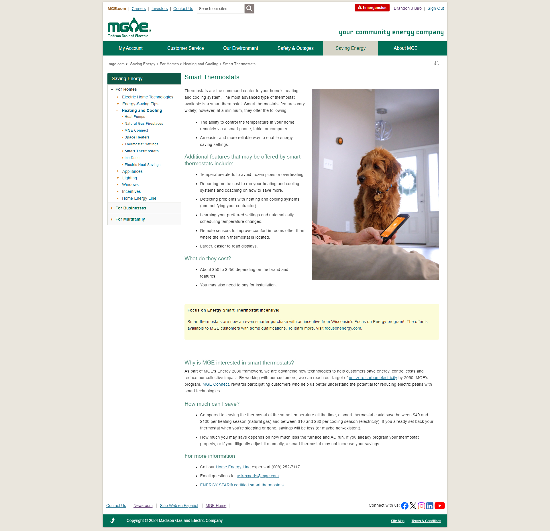
The current design leaves a lot to be desired. Many users have said it looks like a site from the 1990's. Navigation was confusing and inconsistent. The Information Architecture needed an overhaul, along with a layout that is disorganized and stale. Customers didn't feel the website was representative of them and made it hard to trust the company. Behind the log in, the customer experience in the account section was confusing and overly busy.
Research & Design
A group of diverse people, both from a job title and cultural standpoint, was created to give insight about customers and business needs. Focus groups were conducted to gather information about our users, from a business lens. More research and insights were collected from customer focus groups. After reviewing and compiling all this information, I created four stylescapes. These stylescapes were meant to give an idea of what the website would look and feel like. From fonts to colors to media, the designs were carefully thought out. The idea was forward thinking and moving, with a nod to our past.


Narrowing it Down
Everything from the design lens was already more modern, and the design chosen to move forward with, was leaps and bounds ahead...but not quite there. I developed a prototype and went through many refining phases, from simplifying layout ideas to making the color pallete less bright.
We then conducted more testing, using Lyssna. We ran different card sorting tests, for a more streamlined and cohesive Information Architecture. Preference tests helped in nailing down different components, layouts, and templates; gathering data using the System Usability Scale. 5 Second tests gave us feedback on what the user saw and allowed us to change the layout to push messaging. Finally, surveys gave us a lot of good feedback on what people felt about the design.
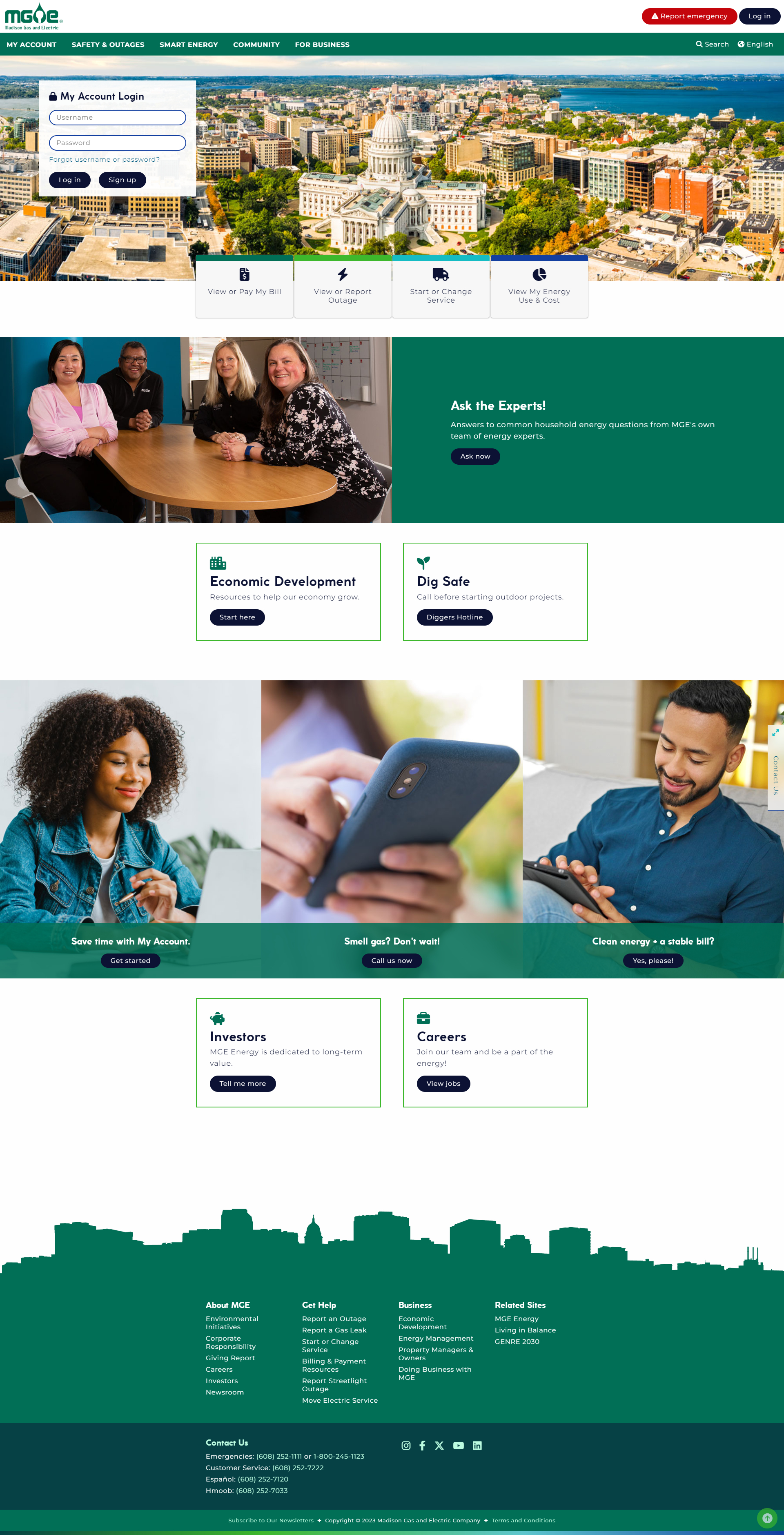
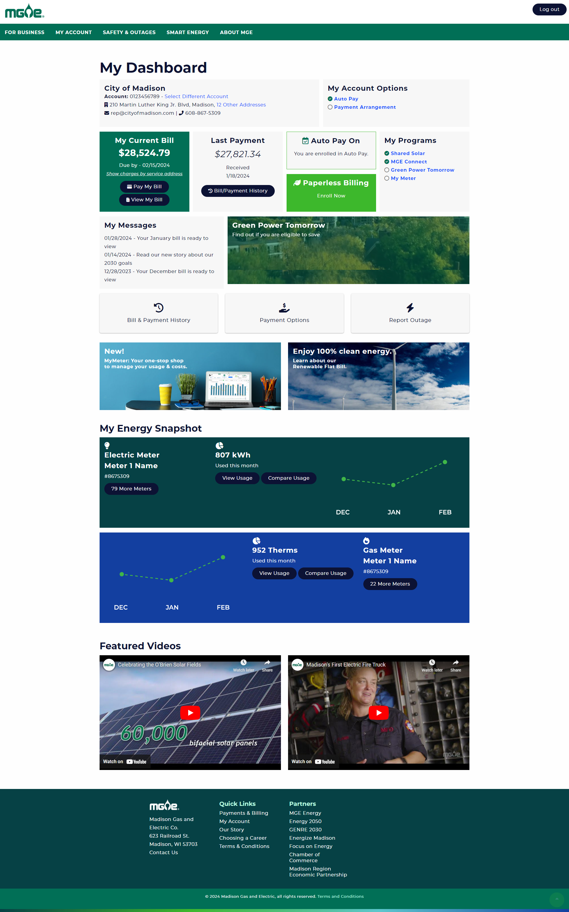
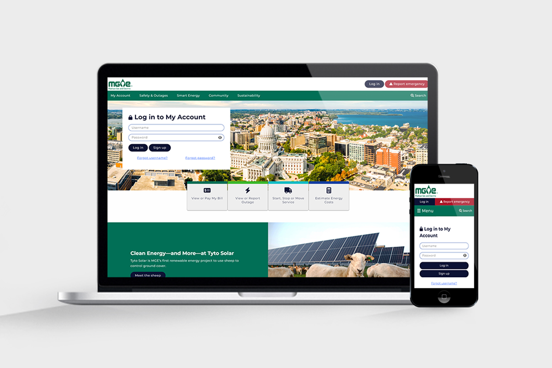
With the design evolving we moved forward with building the site and entering content. Here you can see the design(s) we moved forward with. There is still a lot of work to do for this project as we continue to run the post launch with an agile methodology. It is moving along in the right direction and both employee and customer feedback has been fantastic.
Working on this website redesign, which spanned several years and involved numerous teams, has been an incredible learning experience as a visual and user experience designer. One of the biggest takeaways is the importance of collaboration—balancing the creative vision with technical constraints and ensuring consistency across different contributors is key to achieving a cohesive final product. Flexibility and adaptability were crucial as priorities shifted, and new technologies emerged over time. Additionally, I learned the value of user-centered design: keeping users' needs at the forefront not only guided our decisions but also ensured the site evolved in a way that genuinely enhanced the overall experience. Patience and persistence were vital throughout this long-term project, and in the end, it’s deeply rewarding to see how all these pieces came together to create a seamless and visually engaging experience.
MGE